En: Rebranding UGLE
Rebranding UGLE
Source: FREEMASONRY TODAY (8 DEC 2015)
Aiming to modernise the face of Freemasonry, UGLE’s new image also retains a strong sense of its history. We explore the thinking behind the changes to the branding
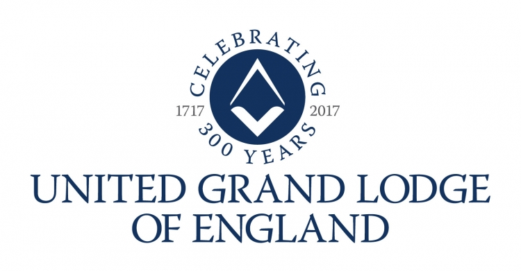
Look at the cover of this issue of Freemasonry Today and you might spot something out of the ordinary. In the bottom-right corner is UGLE’s new logo. It is the starting point for UGLE’s new branding, which aims to create a unified approach to Freemasonry’s image.
‘In this fast-changing world, Freemasonry needs to attract and retain the best candidates, the future leaders who will assure the long-term success of the Craft,’ says Pro Grand Master Peter Lowndes, explaining the motivation behind the rebrand. ‘As we head towards 2017, UGLE has been examining how it can enhance and modernise the face of Freemasonry.’
With attraction and retention identified as key development areas, the Membership Focus Group has been looking at how to ensure that a new recruit’s expectations match his actual experiences. ‘But the modernisation of Freemasonry is not just about what happens at a lodge meeting,’ says Lowndes. ‘It is also about the image we project. We need a visual identity that is recognisable, that represents our values and heritage, and also reflects our relevance to society.’
With this in mind, in 2013 UGLE approached August, which produces Freemasonry Today, with the brief of evolving the brand. The exercise had to create visual guidelines that would help members, lodges, the Metropolitan area and Provinces communicate with each other – and the rest of the world – in a professional and consistent manner. The UGLE logo was the first challenge: something unique but also true to the spirit of Freemasonry.
‘Metropolitan and Provincial teams now have use of an online Brand Centre, where they can access all the assets – fonts, logos and templates – for their materials.’
Drawing conclusions
The Provincial Grand Master for Somerset, Stuart Hadler, announced the design of the new UGLE logo at the Pro Grand Master’s Annual Briefing Meeting, which brought together Metropolitan, Provincial and District Grand Masters and Grand Superintendents in April. While the coat of arms has for generations been a mark of status and standing in society, Stuart said: ‘Society has changed and a coat of arms no longer communicates the messages that a modern membership organisation needs to convey.’
Initial research established that the square and compasses was the most recognisable masonic symbol. From this traditional icon, the design team began to abstract the shapes to create a look that suggests a forward-looking organisation. After further development based on feedback from the Communications Committee, the Board of General Purposes and the Rulers, an iteration was chosen that was both contemporary and instantly recognisable, while also linking to Freemasonry’s rich heritage.
As well as a new logo, the revised branding gives a standardised approach to font usage. Metropolitan and Provincial teams now have use of an online Brand Centre, where they can access all the assets, such as fonts, logos and templates for their materials.
With the branding currently in soft launch and user-testing stage, the UGLE websites and social media pages will all be rebranded at the start of 2016. The full launch and deployment of branding across the Provinces will happen on 24 June 2016, which is the start of Grand Lodge’s 300th year. It is just one element in the organisation’s ongoing strategy to build a positive reputation for Freemasonry as open and forward thinking to ensure its long-term future.
See also
Links
- (Source) FREEMASONRY TODAY (full article) archive.org link

